We just published a new paper highlighting that nitrogen oxide emissions are coupled with copper production volumes
Copper plays a crucial role in the global transition to a sustainable economy, serving as a key component in electric vehicles, solar panels, and wind turbines. However, copper mining also poses environmental and social challenges that must be addressed responsibly. Assessing the mining industry’s performance and environmental impact is essential for tracking progress toward sustainable development.
A new study, published in Environmental Research Letters, utilizes satellite observations of nitrogen dioxide (NO2) to estimate nitrogen oxide (NOx) emissions over 14 of the world’s largest open-pit copper mines. The monitored sites include major copper mines in the United States, Chile, Peru, Mexico, and Zambia. The emissions mostly originate from the diesel-powered mobile fleet operating over the mines. The highest emissions were observed at the Morenci copper mine in Arizona, USA. The study found that NOx emissions are rising at many sites, particularly in South America. In contrast, emissions in the Zambian mines appear to be declining, likely due to increased electrification of mining equipment. The emissions increase with increasing copper production and moved material volumes.
With growing pressure for the mining industry to align with environmental, social, and governance (ESG) principles, independent monitoring is crucial. Currently, most sustainability reporting in the mining sector relies on self-disclosures by companies, which can be inconsistent and incomplete. Satellite observations provide an independent, timely, and transparent way to track emissions.
Satellite observations can also detect sudden changes in mining operations, such as shifts in fossil fuel usage due to fleet electrification, thereby supporting emission reduction strategies. Satellite-based assessments are especially valuable in regions lacking other monitoring systems, offering actionable data for environmental authorities, non-governmental organizations, and local communities.
The findings are based on NO2 satellite data from the European TROPOspheric Monitoring Instrument (TROPOMI) aboard the Sentinel-5 Precursor satellite. The research was conducted at the Finnish Meteorological Institute’s Space and Earth Observation Centre in collaboration with the University of Vaasa and mining consultant company Rovjok Oy. The study received support from Business Finland through the Spacecasting project and the Research Council of Finland’s proof-of-concept funding. It also contributes to the activities of two Research Council of Finland’s flagship programs: the Atmosphere and Climate Competence Center (ACCC) and the Flagship of Advanced Mathematics for Sensing, Imaging, and Modelling (FAME).
REFERENCE
Ialongo I., Virta H., Hakkarainen J., Özcan C., Ranta M., and Zieleniewski S. (2025): Unveiling nitrogen oxide emissions from open-pit copper mines through satellite observations, Environ. Res. Lett. 20 034041 https://doi.org/10.1088/1748-9326/adb767
Annual average NOx emissions over 14 open-pit copper mines for the year 2023 derived from the satellite observations. Image: I. Ialongo, FMI.
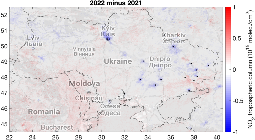
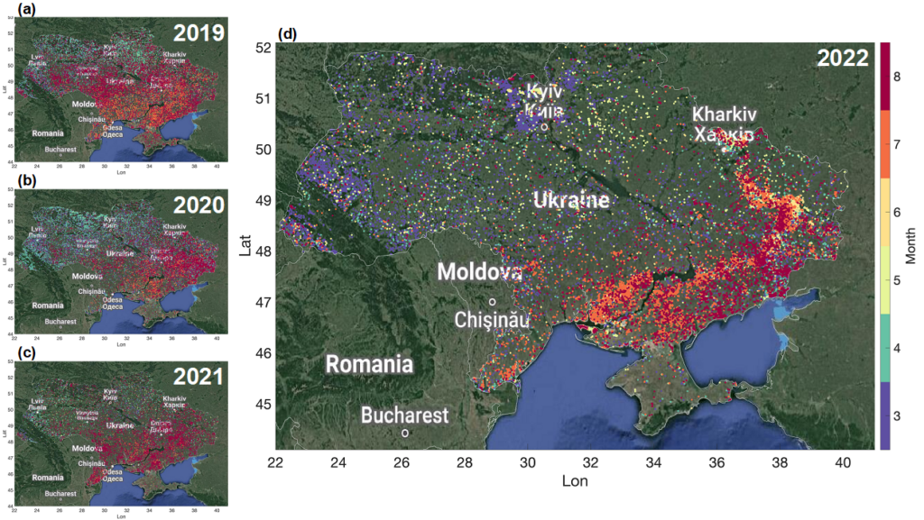
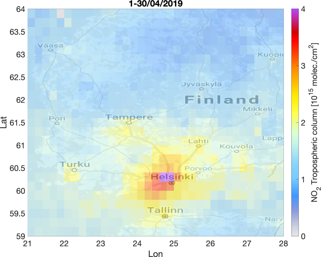
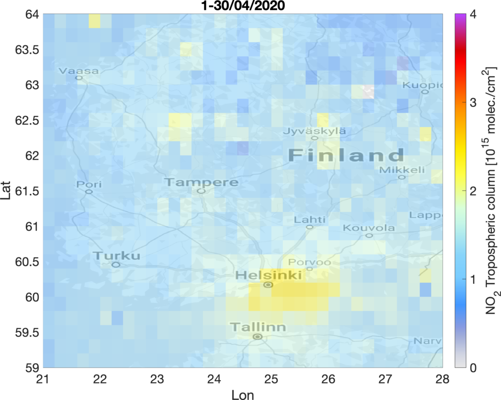
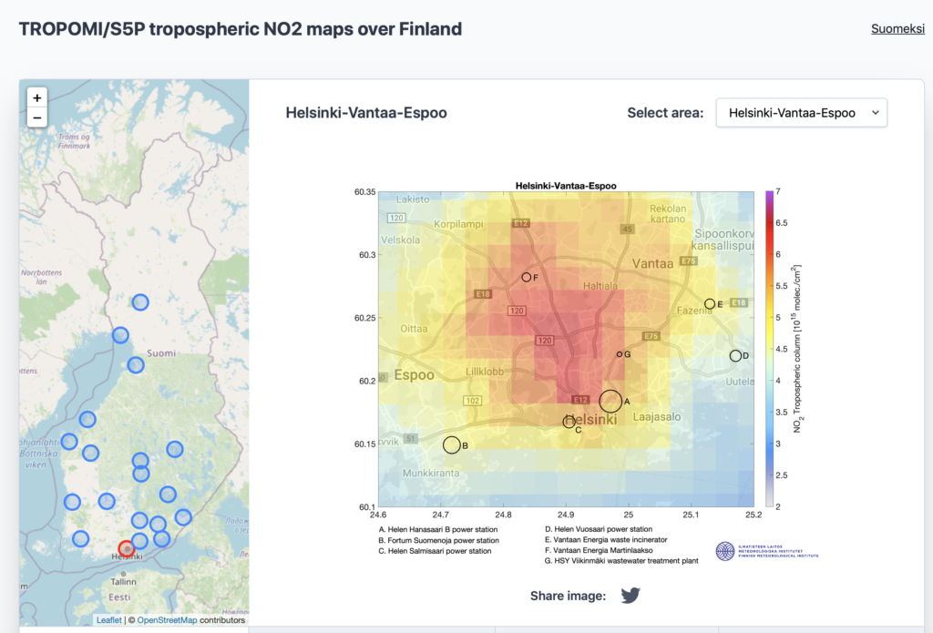
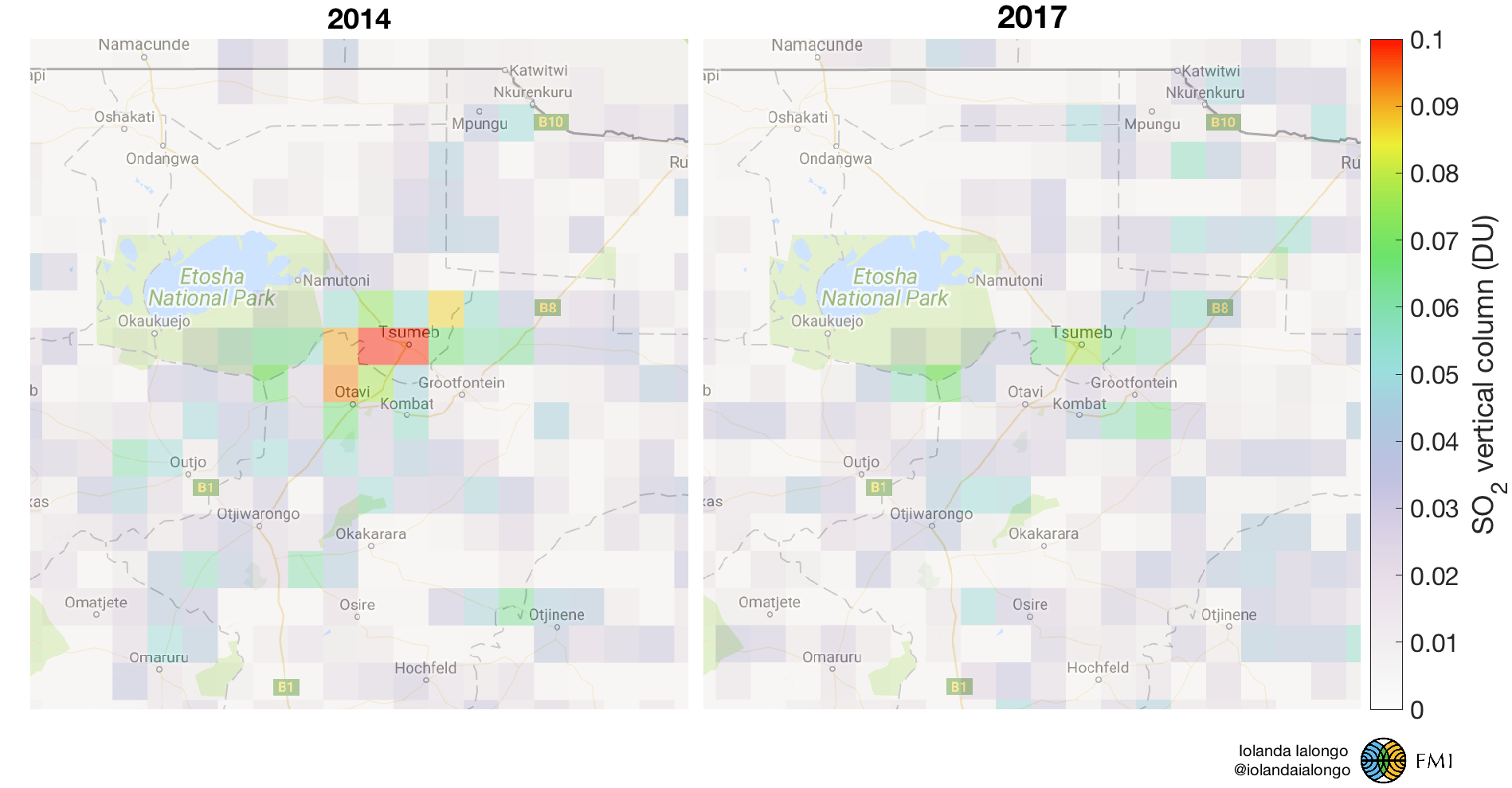
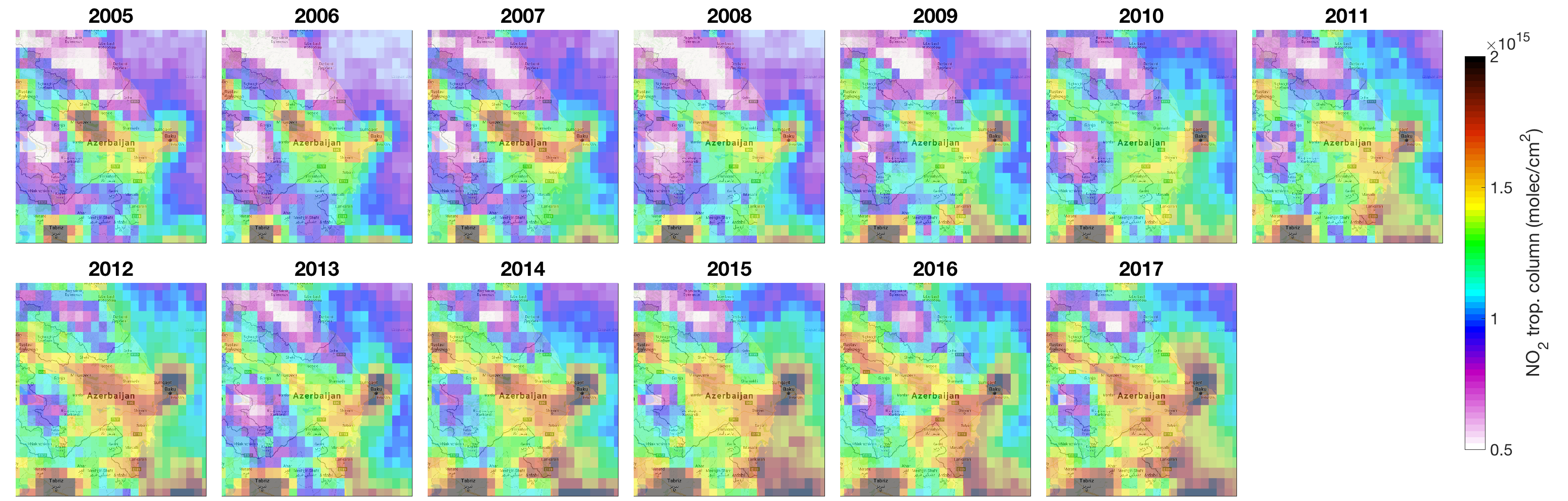

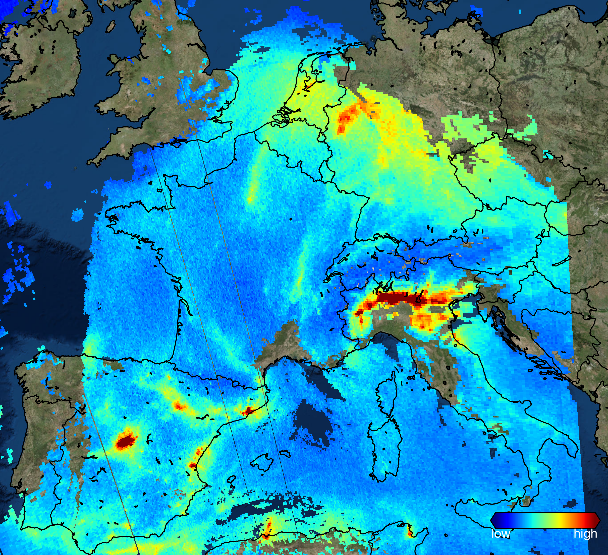
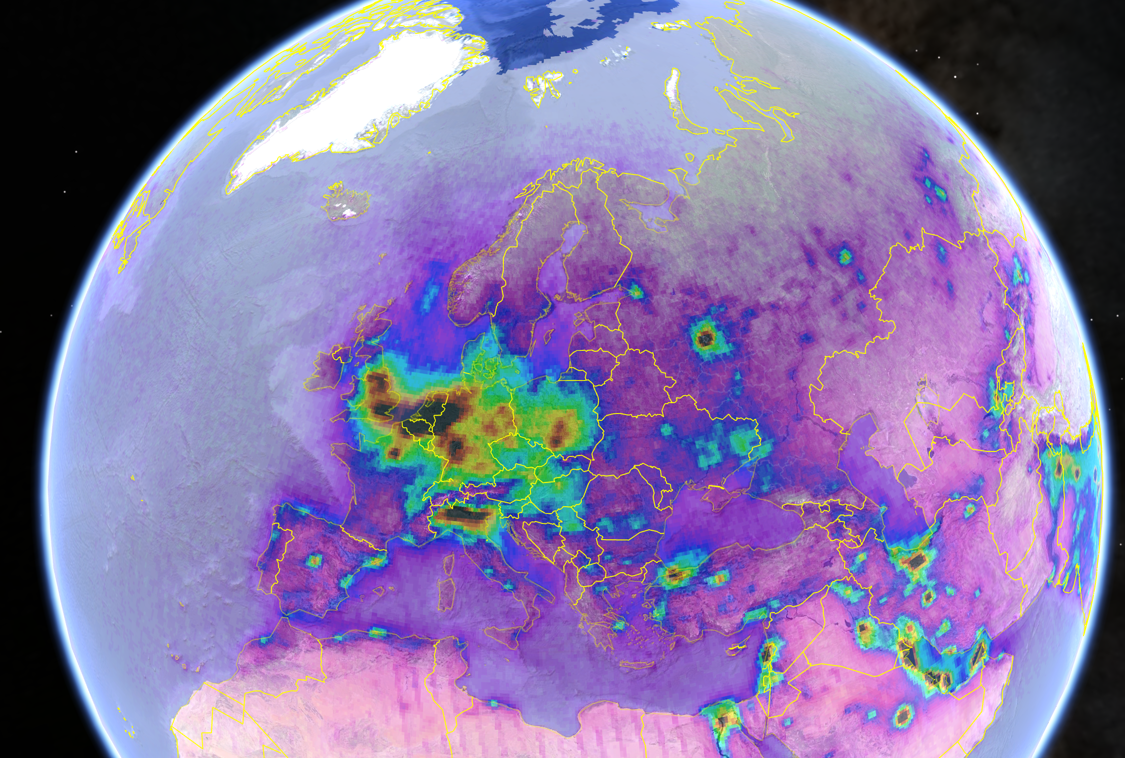
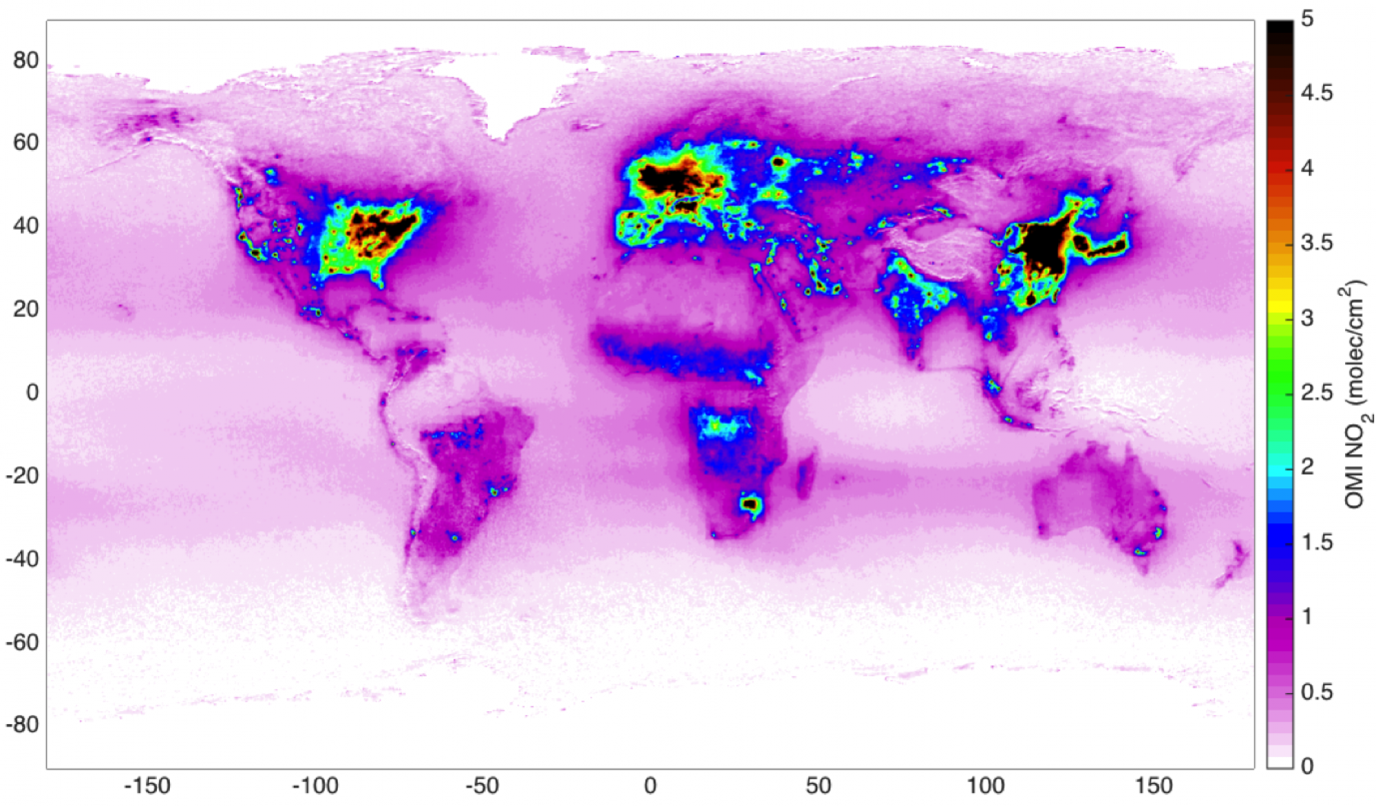
 Image: sampo.fmi.fi
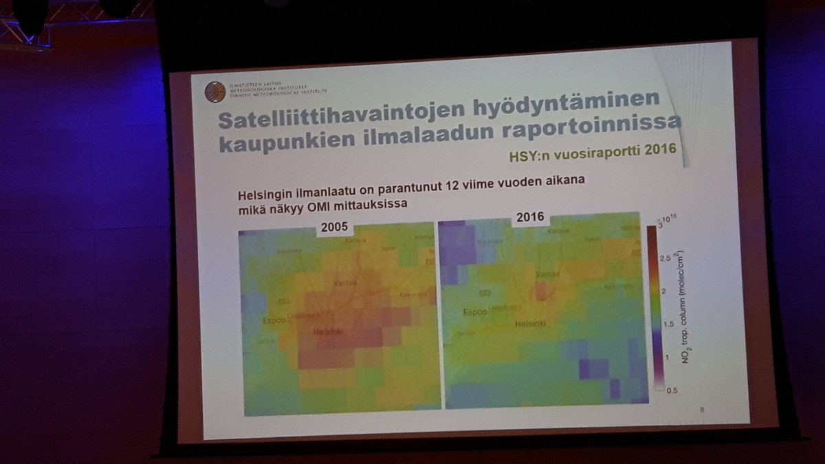