After a long brake I am here again writing about satellite data and atmosphere!
This break included, among other things, a new child and a global pandemic. Now the little girl is conquering kindergarten while the pandemic is still here, so I write you from month number ten of remote working.
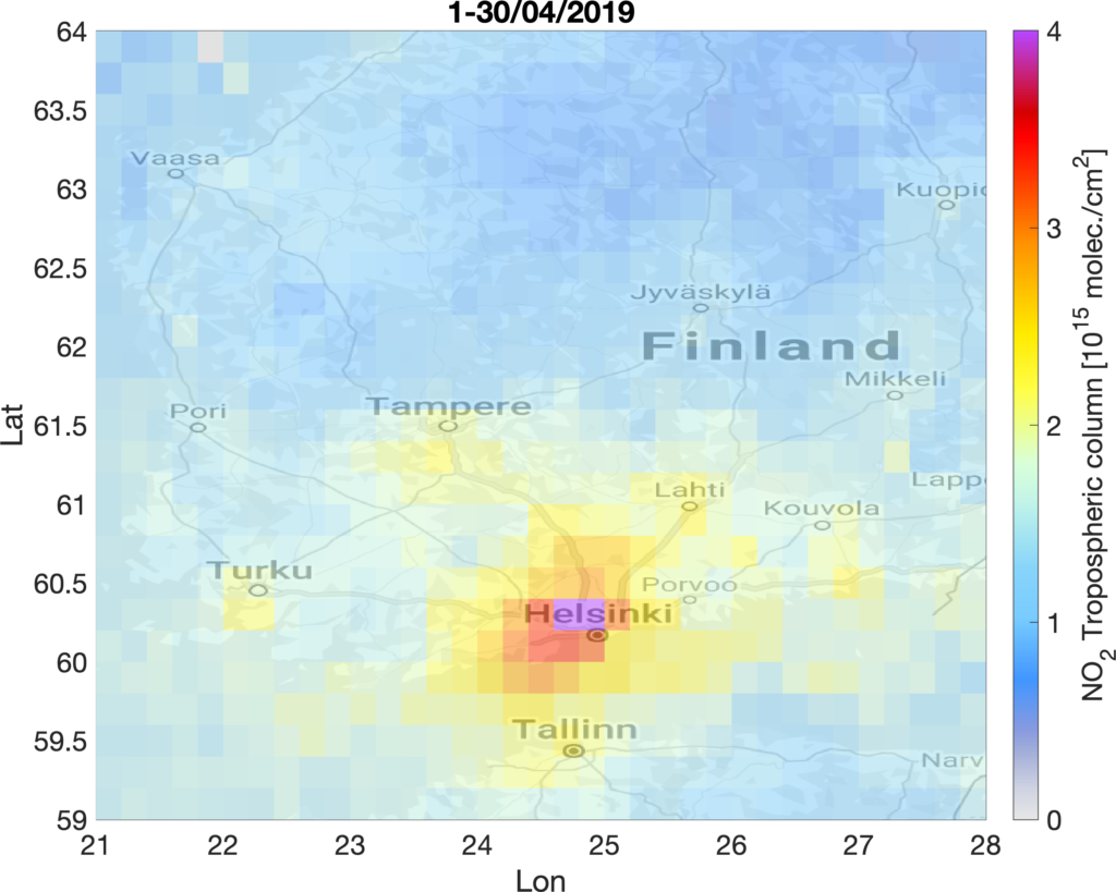
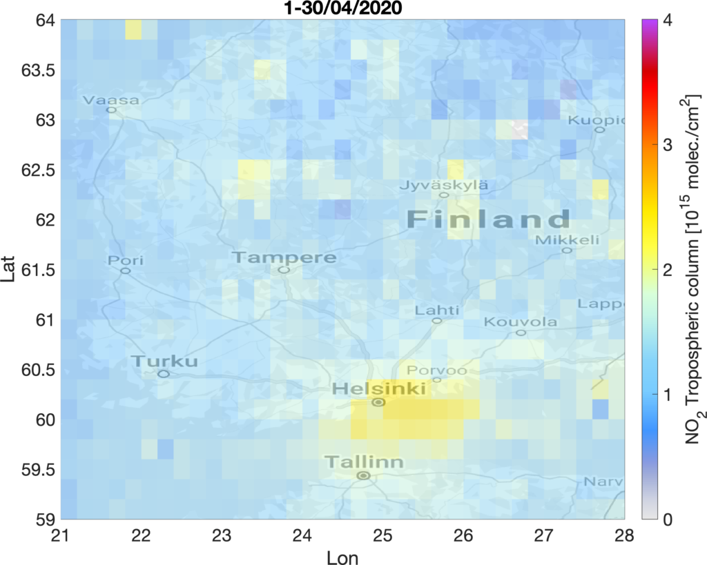
During the spring-summer we saw satellite NO2 maps everywhere. The reason is that the reduced mobility and energy consumption caused the NO2 emissions into the atmosphere to decrease during the COVID19 pandemic lockdowns. Many cities saw their pollution levels going down in 2020 compared to previous years. Helsinki was no exception. TROPOMI NO2 maps showed up to 40% lower pollution levels in April 2020, compared to the same period in 2019. While this difference is not only caused by emission reductions related to the lockdowns, a certain fraction of this drop is related to COVID19 effects. Unfortunately these changes have been only temporary and the EU green-deal proposals for economic recover are still to be realised.
Several tools and dashboard have been developed during the last months in order to address the increasing need to use satellite observations for monitoring changes in air pollution. Some examples are:
EO Dashboard https://eodashboard.org
Rapid action on coronavirus and EO https://race.esa.int
Copernicus Sentinel-5P Mapping Portal https://maps.s5p-pal.com
NASA Global NO2 monitoring homepage https://so2.gsfc.nasa.gov/no2/no2_index.html
Inspired by these nice tools we decided to build a simple platform including TROPOMI/S5P tropospheric NO2 maps over the main cities and industrial emission sources in Finland.
You can find it here: https://sampo.fmi.fi/airpollution/no2/
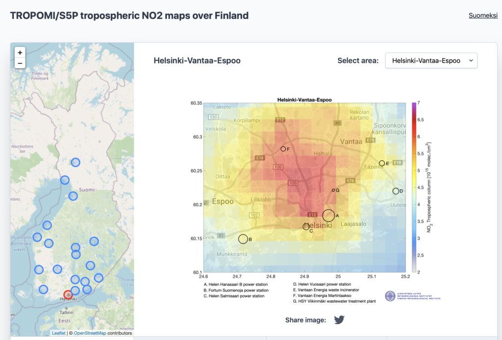
The maps are based on annual averages of the tropospheric NO2 retrievals obtained by the Copernicus TROPOMI/Sentinel-5P satellite instrument. Concentrations of short-lived gases like NO2 can be used as proxies of NO2 emissions when averaged in time and space, since averaging removes some of the short-term variability due to changing meteorological conditions. The black circles in the maps indicate the known stationary NO2 emission sources from the E-PRTR database. The size of the circle is proportional to the 2017 annual emissions. The rest of the emissions come from the transportation sector (road and shipping). The platform will hopefully help inform non-expert users about the capability of these new satellite observations for air pollution monitoring.
Finally on the more strictly scientific side, if you are interested to see how TROPOMI NO2 products are validated against ground-based reference measurements check out our recent work (Ialongo et al., 2020).
Talk to you next time, hopefully before other two years.
Iolanda