Satellites capture socioeconomic disruptions during the 2022 full-scale war in Ukraine 

Satellite observations show significantly reduced air pollution levels over the major Ukrainian cities, power plants and industrial areas. 

Since February 2022, the full-scale war in Ukraine has been strongly affecting society and economy in Ukraine. Satellite observations provide crucial information to objectively monitor and assess the impacts of the war.  

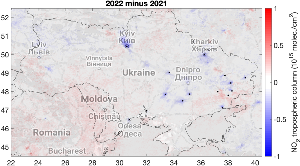
We published a new paper last Friday on Scientific Reports which utilizes satellite observations of air pollutants and other relevant parameters from multiple platforms to assess the impacts of the ongoing war on the Ukrainian society. Satellite observations show that the concentrations of nitrogen dioxide (NO2), which is emitted through fossil fuel combustion processes, declined in 2022 over the major Ukrainian cities, power plants and industrial areas by 15–46%.  

Such reductions reflect the decrease in population and corresponding emissions from the transport and commercial or residential sectors as well as the decline in industrial production, especially from the metallurgic and chemical industry, which led to a reduction in power demand and corresponding electricity production from power plants. Carbon dioxide (CO2) observations also indicate reductions in fossil fuel combustion, especially in eastern Ukraine, where the largest emission sources are located.  

“During peaceful times, reductions in nitrogen dioxide concentrations as those observed here would be considered as a welcome improvement of air quality and human health. In this case, the observed changes tell a different story about the extent of the disruption caused by the war on the Ukrainian society and economy. Also, the reductions in fossil fuel consumption in Ukraine might have been partly offset by an increase elsewhere”, explains senior researcher at the Finnish Meteorological Institute Iolanda Ialongo, who led the work. 

Difference of the March-August mean tropospheric NO2 columns between 2022 and 2021 based on S5P/TROPOMI observations. Blue colours indicate reductions observed in 2022. Black dots correspond to the major cities, industrial areas, and power plants. Image: I. Ialongo, FMI. 
Exceptional fire patterns near the front line  

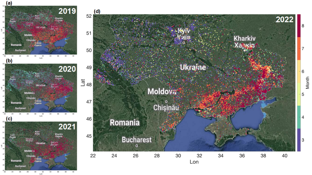
Satellite imagery and fire detections indicate an anomalous distribution of fires along the front line, which are attributable to shelling or other war-related fires, rather than the typical homogeneously distributed fires related to crop harvesting. Satellite imagery data also show drastic changes over the city of Mariupol, which was attacked during the first three months of the war.  

The signal from the hot smokes from the metallurgic industrial facilities in the city disappears from the satellite imagery after March 2022, which suggest an interruption of industrial activities, and, correspondingly, NO2 levels decreased. 

Fire detections from Suomi-NPP VIIRS over Ukraine between March and August for the years 2019–2022. Colors correspond to the month number. Several fires were observed north-west of Kyiv during March, when the Russian offensive focused on the area surrounding the Ukrainian capital. Towards the summer, the fires are mostly detected along the front line in the eastern and southern parts of the country, which is in line with the location of the frontline at that time. Image: I. Ialongo, FMI. 
The results are based on the NO2 retrievals from the European TROPOMI (TROPOspheric Monitoring Instrument), onboard the Sentinel 5 Precursor satellite, and the CO2 observations from the NASA’s OCO-2 satellite. Also satellite imagery from the Sentinel 2 satellite was analyzed as well as fire detections from the Visible Infrared Imaging Radiometer Suite (VIIRS).  

The research was carried on at the Finnish Meteorological Institute together with colleagues from the University of Lviv (Ukraine) and USRA (USA). The Finnish part of the research was supported by the Ministry for Foreign Affairs of Finland via the Interinstitutional Development Cooperation Instrument (ICI), UHMC-FMI Meteorology project and the Research Council of Finland. 

The hope is that the results will support authorities in better assessing the effect of the war on the Ukrainian society.

Further information: 
Senior researcher Iolanda Ialongo, Finnish Meteorological Institute, iolanda.ialongo@fmi.fi 
Scientific article is available on Scientific Reports
Reference: Ialongo, I., Bun, R., Hakkarainen, J. et al. Satellites capture socioeconomic disruptions during the 2022 full-scale war in Ukraine. Sci Rep 13, 14954 (2023). https://doi.org/10.1038/s41598-023-42118-w

NO2 distribution over Finland mapped from space

After a long brake I am here again writing about satellite data and atmosphere!

This break included, among other things, a new child and a global pandemic. Now the little girl is conquering kindergarten while the pandemic is still here, so I write you from month number ten of remote working.

During the spring-summer we saw satellite NO2 maps everywhere. The reason is that the reduced mobility and energy consumption caused the NO2 emissions into the atmosphere to decrease during the COVID19 pandemic lockdowns. Many cities saw their pollution levels going down in 2020 compared to previous years. Helsinki was no exception. TROPOMI NO2 maps showed up to 40% lower pollution levels in April 2020, compared to the same period in 2019. While this difference is not only caused by emission reductions related to the lockdowns, a certain fraction of this drop is related to COVID19 effects. Unfortunately these changes have been only temporary and the EU green-deal proposals for economic recover are still to be realised.

Several tools and dashboard have been developed during the last months in order to address the increasing need to use satellite observations for monitoring changes in air pollution. Some examples are:

EO Dashboard https://eodashboard.org

Rapid action on coronavirus and EO https://race.esa.int

Copernicus Sentinel-5P Mapping Portal https://maps.s5p-pal.com

NASA Global NO2 monitoring homepage https://so2.gsfc.nasa.gov/no2/no2_index.html

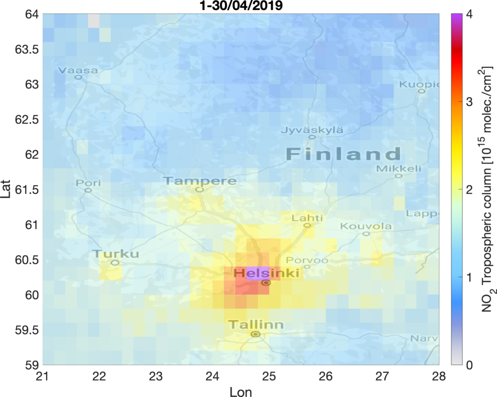
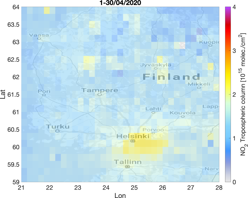
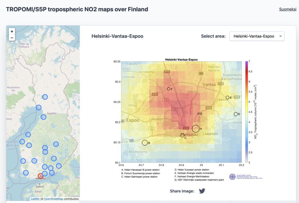
Inspired by these nice tools we decided to build a simple platform including TROPOMI/S5P tropospheric NO2 maps over the main cities and industrial emission sources in Finland.

You can find it here: https://sampo.fmi.fi/airpollution/no2/

The maps are based on annual averages of the tropospheric NO2 retrievals obtained by the Copernicus TROPOMI/Sentinel-5P satellite instrument. Concentrations of short-lived gases like NO2 can be used as proxies of NO2 emissions when averaged in time and space, since averaging removes some of the short-term variability due to changing meteorological conditions. The black circles in the maps indicate the known stationary NO2 emission sources from the E-PRTR database. The size of the circle is proportional to the 2017 annual emissions. The rest of the emissions come from the transportation sector (road and shipping). The platform will hopefully help inform non-expert users about the capability of these new satellite observations for air pollution monitoring.

Finally on the more strictly scientific side, if you are interested to see how TROPOMI NO2 products are validated against ground-based reference measurements check out our recent work (Ialongo et al., 2020).

Talk to you next time, hopefully before other two years.

Iolanda

How can we use satellite observations of air pollutants beyond academia?

Air pollution monitoring from space can be performed over different type of sources, such as cities (where emission are dominated by the contribution of transportation), industrial areas or power plants.

One of the main advantages of satellite observations is their global coverage. This allows for example to compare the pollution levels over different countries or to evaluate how they change over time. This feature makes them particularly useful for monitoring air quality in developing countries, where no comprehensive ground-based air quality monitoring network is typically available or air quality information are not available as open data. For example, in a rapidly developing country like India, satellite atmospheric data can come in handy for monitoring the polluting emissions from coal-based energy production, atmospheric particulate matter (aerosol) emitted by crop burning and outdoor cooking and increased industrial activity and urbanisation. The general lack of polluting emission regulations in the country further increase the negative effects of air pollution on the human health of local populations.

But what else is out there? One approach that has been overlooked, is based on the idea to combine satellite-based atmospheric data with auxiliary non-geophysical information, such as socio-economic data, population changes, health impact, trade indexes as well as information on corporate environmental responsibility performance. How can these different data be combined together and how do they correlate to each others? Also, is there a link between air pollution levels and politics? Is poverty related to bad air quality or democracy to clean air? All these global questions are open and satellite-based observations of air pollutants might help in providing an answer.

And what about the users? Accurate information on air pollutants are needed by decision-makers from both public and private sector: city environmental authorities, companies trying to reduce their environmental impact and to achieve their sustainability goals, policy makers planning new emission control regulations, teachers at school looking for updated educational material, citizens interested in getting information on air quality issue all over the world.

The potential applications of satellite-based observations of air pollutants are many. Are we up for the challenge?

I.

P. S. If you are a Finnish speaker you can check out a few example of satellite data application for air pollution monitoring here

Societal applications of satellite-based observations: a few examples

I’ve had not much time to write in this blog lately, so I’ll try to redeem myself before summer holidays with a few quick posts on my latest work.

Recently I’ve been involved in several applications of satellite-based observations for air pollution monitoring. I wrote about it a little bit in this article for FMI ATMOS article. The one that made me more proud was the collaboration with the Finnish cleantech company Outotec, that operates in the metal smelting sector. Their technological solutions help companies improve their sustainability by eliminating sulfur dioxide emissions (SO2) in the air. We used OMI SO2 observations to verify the emission reductions over several copper smelters all around the World.

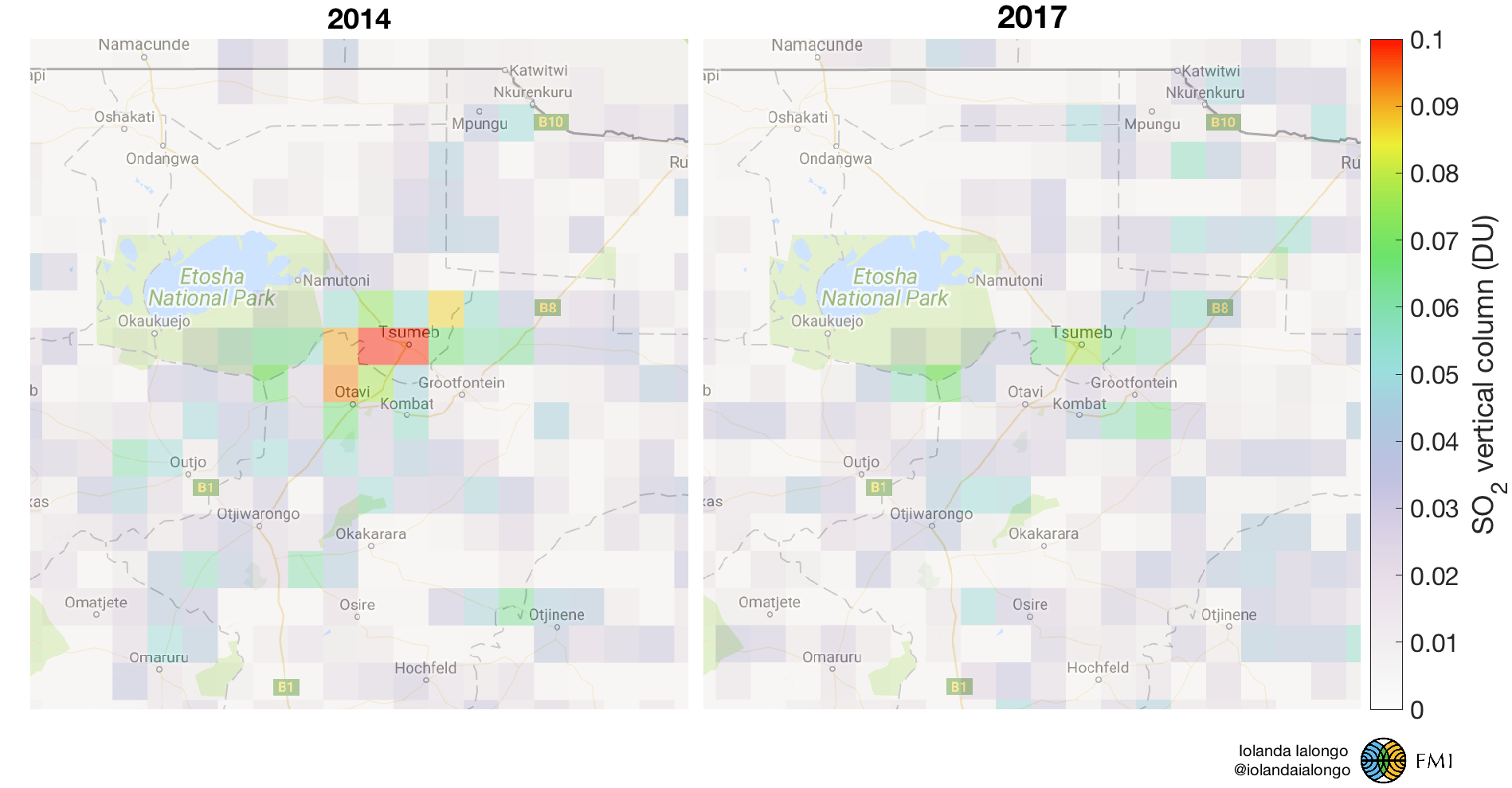
The first example was the copper smelter in Tsumeb (Namibia), where a sulfuric acid plant was implemented in 2015. The figure below shows how the SO2 concentrations in Tsumeb were reduced from 2014 to 2017, as an effect of the operative sulfuric acid plant. It was estimated that the SO2 emissions were reduced by more than 80%. These maps are based on OMI SO2 retrievals.

Annual mean OMI SO2 PBL vertical columns in 2014 and 2017 over Tsumeb (Namibia). Red color indicated elevated SO2 concentrations. The high levels of SO2 observed in 2014 disappear in 2017, after the implementation of sulfur removing technology at the smelter.

These results were featured in the Outotec sustainability report for 2017 and recognised also by the Millennium Technology Prize on social media. More cases are under study to support this and other companies in achieving their sustainability goals. I hope to publish a paper about these results soon.

More satellite-based applications for international cooperation projects

The added value of satellite observations is the strongest over areas where no other air quality data are available. This make them especially useful as background information in international cooperation projects. Finland is actually the World second country in term of budget for cooperation project in the field of meteorology and FMI is involved in many of those projects. Satellite data were used for example to evaluate the spatial distribution of  NO2 and SO2 pollution in Ukraine and the changes related to the war against Russia and to environmental policies. Also, I prepared a training seminar for our collaborator in Azerbaijan to illustrate the potential of satellite data in monitoring air pollution in their country as well. The map below shows the annual mean NO2   levels in the troposphere as seen from OMI since 2005. In particular the area around Baku experienced a sensible increase in pollution, making it one of the most polluted cities in the World.

OMI tropospheric NO2 in Azerbaijan.


SLUSH17 and TROPOMI first-light

Last week has been very exiting for many reasons.

I addended SLUSH17 startup event in Helsinki, where 20000 people met to pitch their business ideas and to find investors to make them real. It was actually weird to notice how differently entrepreneurs think. We researchers are extremely conservative sometimes. Maybe that’s how it should be. But perhaps we loose a little bit the big picture. We typically focus on a tiny part of a much larger problem to solve and we should try to keep in mind why we do what we do.

So what was a researcher like me doing at SLUSH17? Well, since I am always looking for new applications for atmospheric satellite data, I though to go and see what people outside academia are thinking. Looking for inspiration, basically. I got an academic pass and I went on listening pitches and speeches  covering the most different topics.

The event started with some nice words from the Finnish President Niinistö and with a present from the SLUSH community to Finland for its 100 years birthday: the hashtag #BragForFinland. Finnish people are typically know for being too modest and it might be useful to learn something about self-celebrating. A very interesting speech came also from Al Gore, that covered something really close to my work. He spoke about the climate crisis and all the tools that we have now to respond to this crisis. He encouraged entrepreneurs to embrace this challenges coming from climate change and to be part of the solution.

Another reason I was there was the Skolar Award. The Finnish company Kaskas Media organised this science pitching competition for the third time this year to promote new original ideas from different sectors of science. Janne Hakkarainen was ready to pitch last Friday the idea of monitoring greenhouse-gas man-made emissions using satellite data. He did not win at the end but he pitched like a rockstar. You can read more about this on his blog: http://jannehakkarainen.blogspot.fi/2017/11/slush-2017-skolar-award-science-pitching.html or watch the pitching from here: https://www.youtube.com/watch?time_continue=19797&v=6-c_VQtP8WA

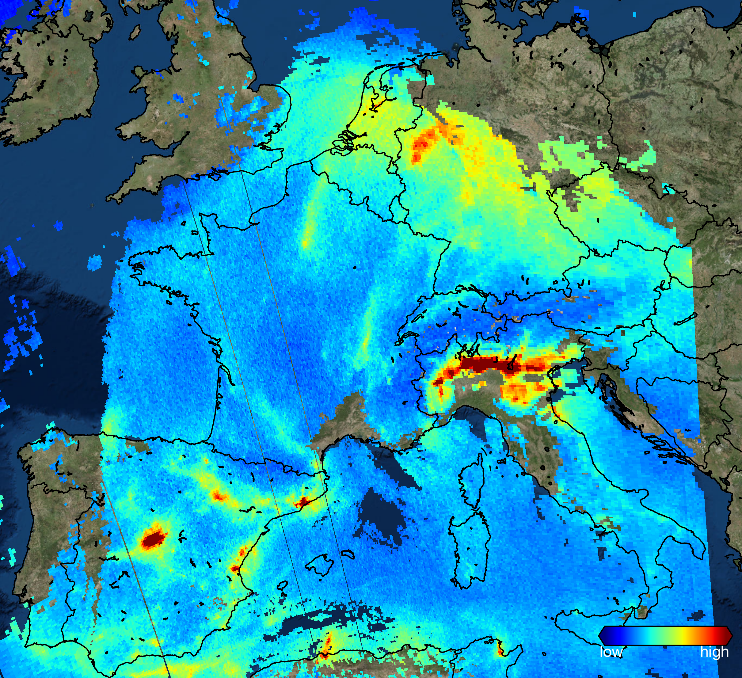
On the same day, TROPOMI’s first-light press conference also happened. ESA came out with incredibly detailed pictures of air pollutants like for example this mind-blowing picture showing the NO2 levels in Europe for November 22nd. If you though OMI is great (and it is!), this is now another level of greatness.

These new data will further revolutionize the way we monitor air pollution as they provide high definition global information on air pollution on daily bases. Looking forward to use Tropomi data for more and more applications.

Stay tuned!

Iolanda


India is the new China

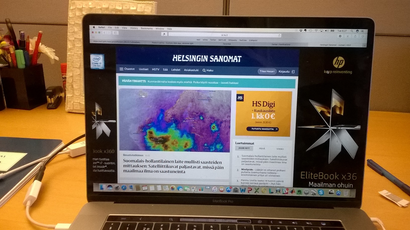
Last week India was a lot in the news because of the extremely bad air quality in Delhi due to crop burning, pollution and unfavourable meteorological condition. Helsingin Sanomat talked about children getting sick in Delhi, schools closing for the smog, car crashes due to scarce visibility and what not. Check out the full article here in Finnish: https://www.hs.fi/ulkomaat/art-2000005445006.html

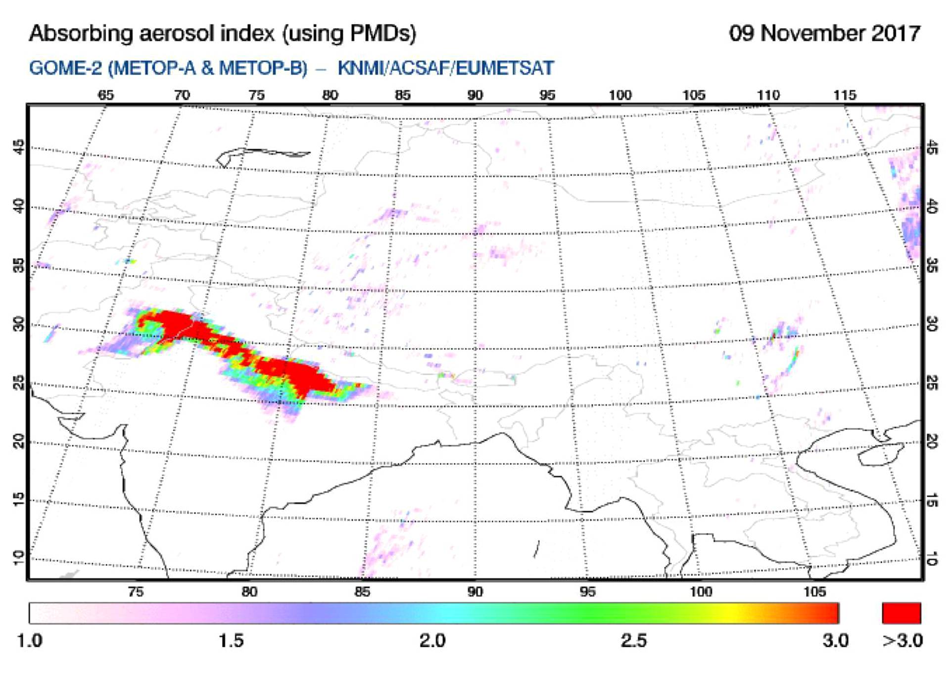
They also used satellite data to illustrate the problem to the readers as for example with this map of aerosol index from GOME-2:

GOME-2 aerosol index on November 9th, 2017. Red colours indicate extremely high concentrations of particulate matter in the atmosphere over northern India.

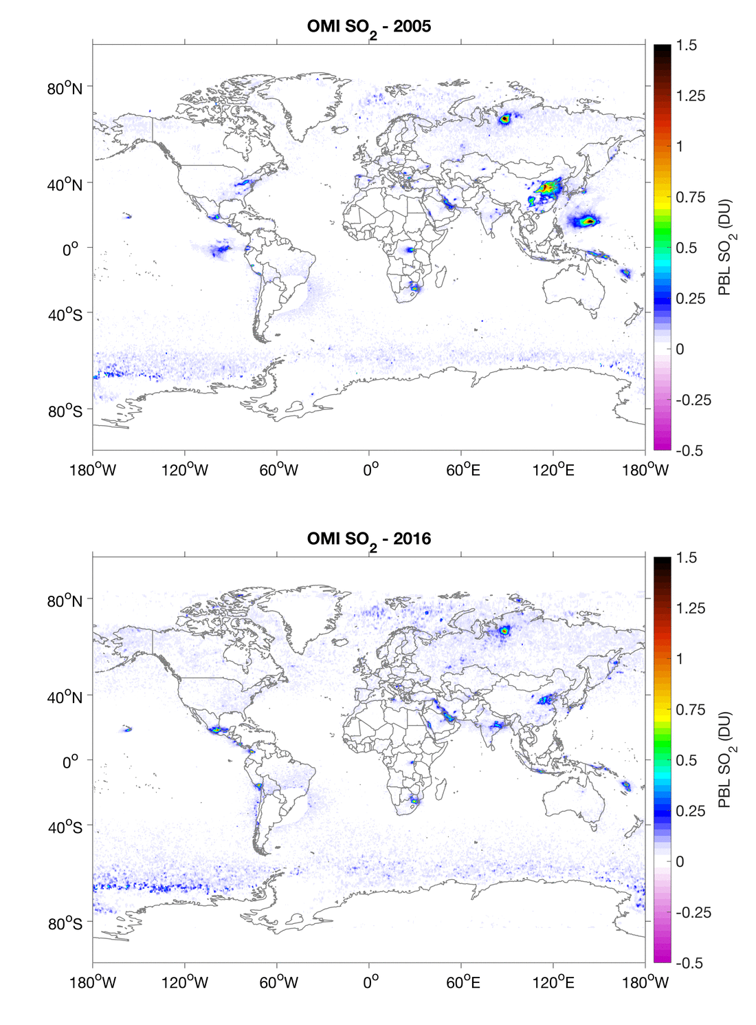
Almost at the same time, a new Nature paper by our Nasa colleagues came out with the title “India Is Overtaking China as the World’s Largest Emitter of Anthropogenic Sulfur Dioxide. Their results are based on OMI SO2 observations and on the emission estimation based on such satellite data. SO2 (sulfur dioxide) is an air pollutant typically produced when coal is burned to generate electricity and it is found in high concentrations close to power plants, smelters and refineries. They found that sulfur dioxide emissions increased by 50% in India, while they fell by 75% in China over the last decade.

I think these results really put things into perspective. While this specific episode of smog is occurring during the crop burning season, it is worth stressing the context in which this is happening. Have a look at the global SO2 maps for 2005 and 2016 below, and try to find the differences (be careful though, some of them are volcanoes!). You will see that, according to OMI satellite data, air polluting emissions decreased dramatically in USA and Europe and recently also in China, while growing in India, as a result of the increasing amount of coal burning power plant installed in the country.

OMI SO2 concentrations in the lower levels of the atmosphere in 2005 and 2016. High values are in green-yellow-red-black while low in white-blue colours.


This is a gigantic wake up call. It reminds us how crucial the environmental protection policies are and that they should not be taken for granted.

An exciting day in atmospheric monitoring

Let’s take a moment to celebrate. Or self-celebrate.

In a researcher’s life there are really a few moments when everybody, or even somebody, recognise your achievements. When it happens, you mostly feel ashamed of your own success. But today, let’s try another way.

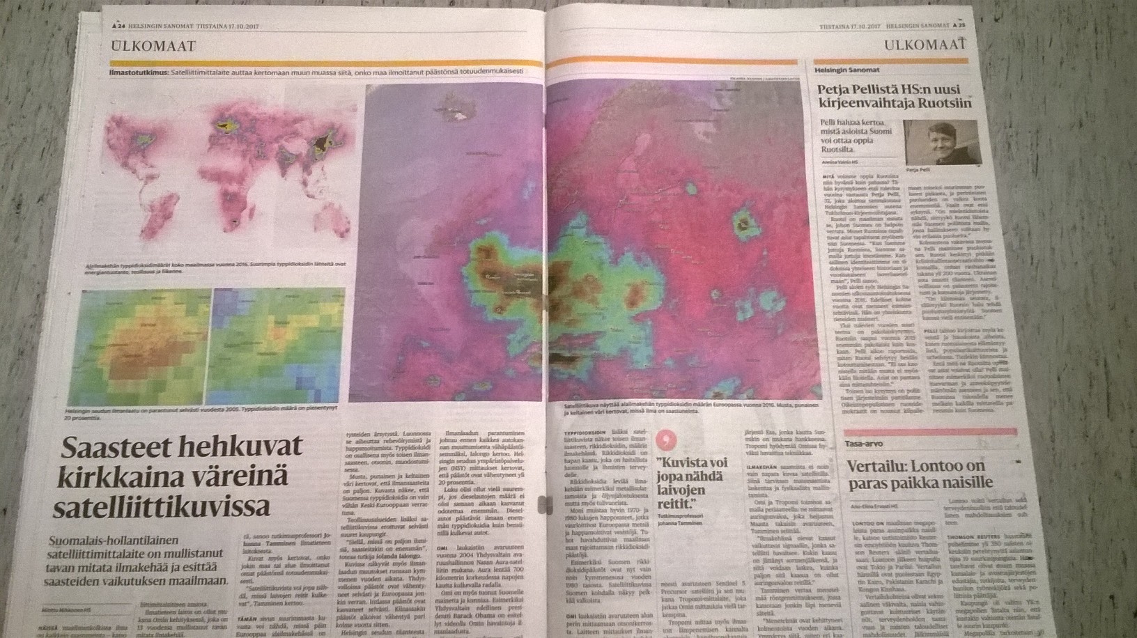
Helsingin Sanomat today published an interview to Johanna and me, including many of my OMI NO2 pictures to monitor air pollution. You can find the article here (in Finnish): https://www.hs.fi/ulkomaat/art-2000005411483.html

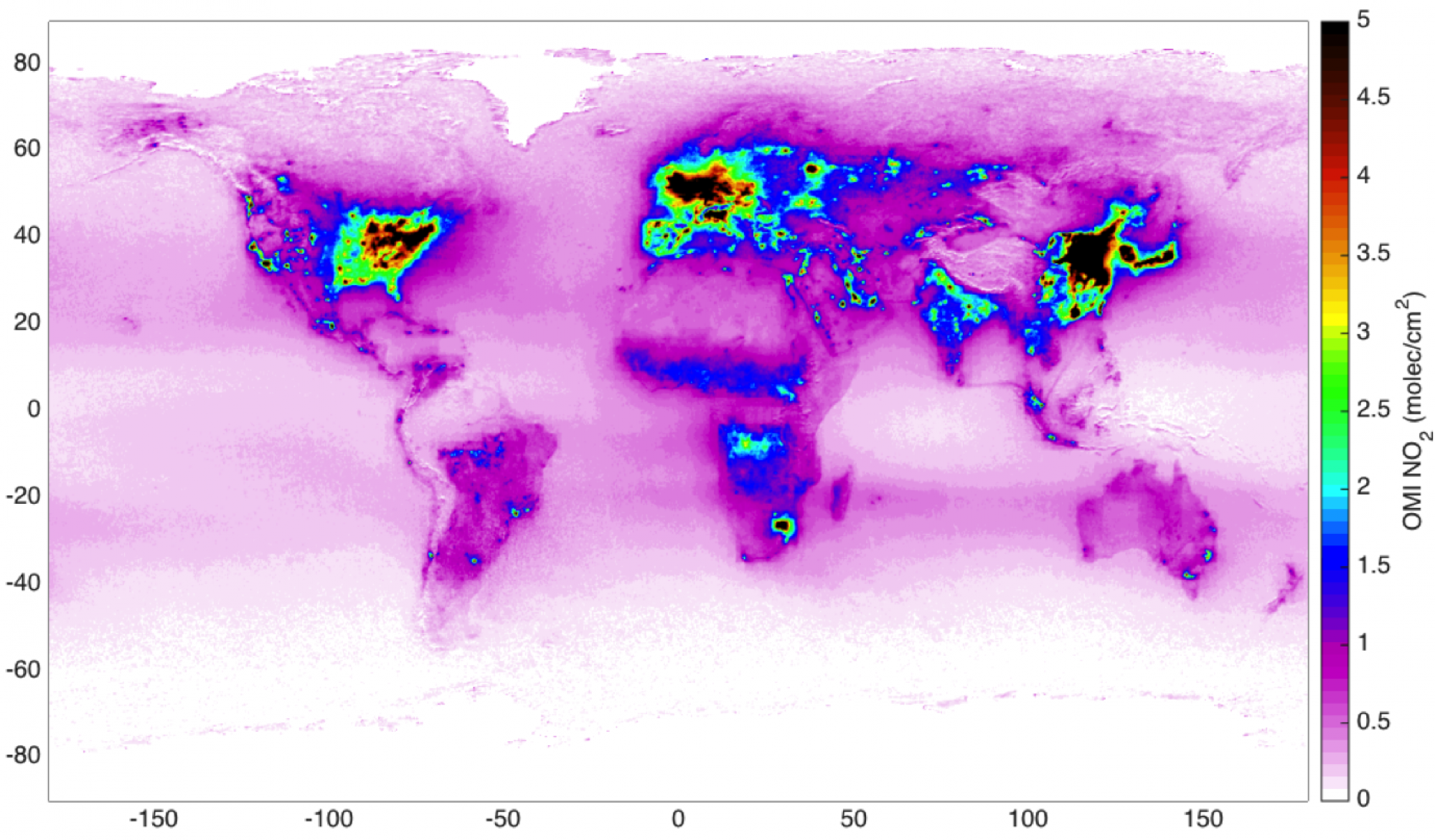
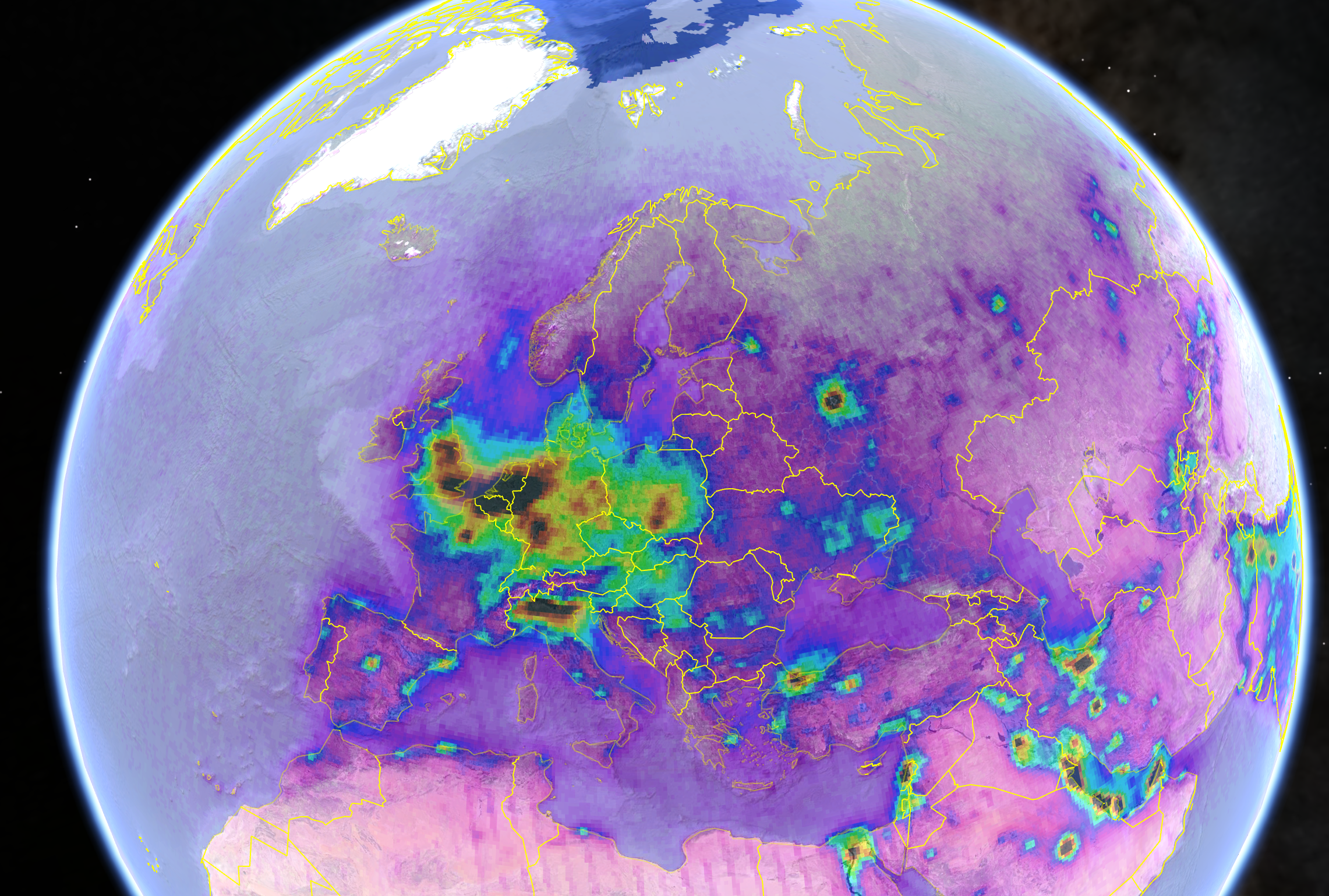
My favourite visualisation is the before/after global map of tropospheric NO2, where you can compare the pollution levels in 2005 and 2016. It’s clear how air pollution increased in India and Middle-East, while decreased in US and Europe. Also in China, the most polluted area in the world, pollution started decreasing a couple of years ago as a result of new environmental policies to protect air quality and the health of the local population.

Before I even had the opportunity to open my computer, I found several post on Twitter, with my pictures going everywhere. We also had the thrill to see our article as the most read for a couple of hours.


And then the Sun became red.

We woke up this morning here in Southern Finland, experiencing something unusual. The smoke from Iberian forest fires and the desert dust from Northern Africa got transported by the Ophelia hurricane towards Northern Europe and affecting the atmospheric composition there. Seppo from our group came out with a quick press release (in Finnish) on FMI homepage, using SEVIRI and, later on, OMI satellite observations of atmospheric particles. Soon after, his words were on MTV3 webpage: https://www.mtv.fi/uutiset/kotimaa/artikkeli/aurinko-varjaytyi-punaiseksi-metsapalojen-hiukkasista-ja-saharan-hiekasta-etelarannikolla/6620780


By coincidence, today there was another interesting article on Helsingin Sanomat about the poor communication skills and readiness of Finnish researchers: https://www.hs.fi/kotimaa/art-2000005411521.html. The article went on talking about the fact that finnish researchers are not used to communicate their results nor they like to do it.

Well, just for today, we beg to differ.

Short story of my TROPOMI week

It has been a crazy week in the name of science communication.

It all started during the weekend when I spent a few hours of my free time helping in writing a press release about OMI achievements during the last 13 years. So, after a couple of late nights working, we came out with a decent text about how OMI atmospheric observations contributed to improve the understanding of the atmospheric processes and on how these results had great impact on society (available here in Finnish: https://ilmatieteenlaitos.fi/tiedote/426785029)


I also spent some time trying do develop a nice visualisation for my air pollution satellite data. I used again space-based gridded NO2 observations from OMI, onboard AURA NASA satellite. Nitrogen dioxide pollutes the air mainly as a result of road traffic and other fossil fuel combustion processes.

In the picture above you can have a look at the air pollution situation in Europe and the Middle-East for 2016. Darker colours correspond to the most polluted areas. In Europe, large pollution hotspots are visible in Central Europe and over the major cities (mainly do to road traffic) and industrial areas (Po Valley, Ruhr area and ore mining industrial area in Poland). In the Middle-East, pollution signatures from the oil extraction activities as well as from the main urban areas.

So, after all this work we put the press release out on the FMI site, in preparation for the TROPOMI launch on Friday.

One hour later this happened:


After that, our hopes to get some attention from any journalist or to have any kind of impact on the public were gone. I never thought that my work would have anything to do with the President of Finland baby news, but it did. When we already gave up, we received a call from Helsingin Sanomat for an interview: so my pictures and the results of years of work will end up on the main Finnish newspaper early next week. I’ll get back to you on that on Monday. Moral of the story, I guess “never give up”.


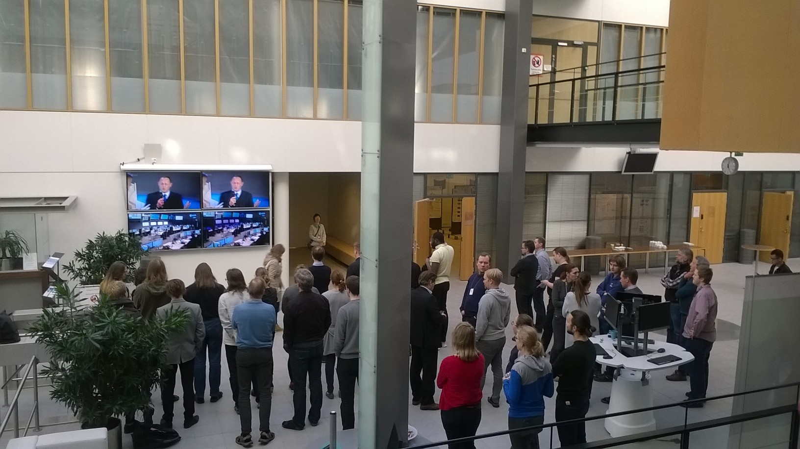
Anyway, this week was TROPOMI week! Today ESA successfully launched its first Sentinel-satellite dedicated to atmospheric composition monitoring: Sentinel 5 Precursor with its only payload TROPOMI (Here the press release in Finnish). TROPOMI will continue OMI atmospheric observations with better spatial resolution and sensitivity. We organised a small happening here in FMI and everybody had the opportunity to get exited in company. The first signal was received and now we can enjoy this moment, knowing that we have opportunity to work on atmospheric remote sensing for hopefully many more years.

I have also got other good news, but I’ll tell you next week. 🙂

Stay tuned,

Iolanda

Report from Air protection days #ilmansuojelupäivät

Satellite-based smoke pictures from ongoing Canadian forest fires on display at #ilmansuojelupäivät

22 August 2017

A large smoke plume from the Canadian forest fires just reached Europe. The picture below shows the OMPS aerosol index maps on August 21st, 2017. Fortunately, this kind of smoke plume is located at very high altitudes and it does not affect the air quality close to the surface. On the other hand, this case-study shows how such local emissions can affect the all globe in just a few days.

Kuva: sampo.fmi.fiImage: sampo.fmi.fi

This recent episode was presented today at the Finnish Air protection days – Ilmansuojelupäivät in Lappeenranta. This is a nice example on how satellite-based observations can be used in the air protection monitoring .

In addition, our talk covered the other applications and potential new opportunities in monitoring air quality and greenhouse gases from space in the Arctic region. Among our results, we showed for example, the air quality improvements in Helsinki visible from OMI observations as well as space-based maps of man-made CO2 emission areas.

Also a lot of other interesting topics today: Climate and air protection goals from the Finnish Chairmanship of the Arctic Council; advancing renewable energy’s use in the Arctic; new results in monitoring black carbon emissions from shipping.

After all this, also a nice dinner at Lappeenranta’s fortress!


Report from IWGGMS13 meeting

Two weeks ago we hosted the 13th International Workshop on Greenhouse Gas Measurements from Space in Helsinki. The meeting gathered the top level scientists in the field of GHG monitoring from space. I followed the highlights of the meeting through the hashtag #IWGGMS13.

I presented a poster on how to monitor anthropogenic CO2 signatures using space-based observations. I showed the advantages and limitations in mapping CO2 emission areas from space for different type of sources and I got many useful feedbacks. I used measurements from OCO-2 (Orbiting Carbon Observatory-2), flying on Nasa’s satellite since 2014. No satellite instrument so far has provided such dense and accurate CO2 observations as OCO-2 all over the globe. This opens new exciting opportunities for monitoring the anthropogenic contribution of the atmospheric CO2 concentrations.

We learned also many new things. The Canadian colleagues presented the first attempt to derive CO2 emissions from a single power-plant based on satellite-based measurements. Also, new miniature-sized commercial instruments showed the capability to target one source at the time for pollution plume detection. In the future, we could make air pollution monitoring more comprehensive and sustainable thanks to space-based observations!

Now it’s time to go holiday but I’ll be back in August with more news.

i.